- how to create a simple modal dialog for creating new pins (with Ant Design
 React library)
 - how to execute GraphQL mutations using already configured Apollo Client
In order to follow this tutorial, you must use Webiny version 5.18.0 or greater.
Creating the New Pin Modal Dialog
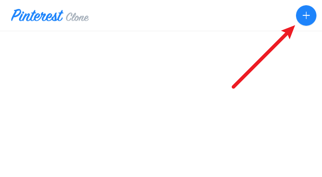
It’s time to create the New Pin modal dialog, which the users will open by clicking on the ⨁ icon, located in the top right corner of the screen.
For starters, let’s create the NewPinModal React component in the pinterest-clone/app/code/src/components/NewPinModal.tsx file:
import React, { useCallback } from "react";
import { Modal } from "antd";
import { Form, Input } from "antd";
import { useMutation } from "@apollo/react-hooks";
import { message } from "antd";
import gql from "graphql-tag";
// The mutation which we'll issue on form submissions.
const CREATE_PIN = gql`
mutation CreatePin($data: PinCreateInput!) {
pins {
createPin(data: $data) {
id
title
description
}
}
}
`;
type Props = {
visible: boolean;
onClose: Function;
};
const NewPinModal: React.FC<Props> = props => {
// A reference to the form rendered below.
const [form] = Form.useForm();
// A simple mutation for creating new pins.
const [createPin] = useMutation(CREATE_PIN);
// Once the form is submitted and all field validation is passing, this callback will get executed.
const onFinish = useCallback(async ({ title, description }) => {
await createPin({
variables: {
data: { title, description }
},
refetchQueries: ["ListPins"]
});
message.success(`New pin ${title} created successfully!`);
form.resetFields();
props.onClose();
}, []);
// Submits the form and only triggers the `onFinish` callback if all fields are valid.
const onModalOk = useCallback(() => form.submit(), [])
// Reset the form and close the modal dialog.
const onModalCancel = useCallback(() => {
form.resetFields();
props.onClose()
}, [])
return (
<Form labelCol={{ span: 4 }} wrapperCol={{ span: 20 }} form={form} onFinish={onFinish}>
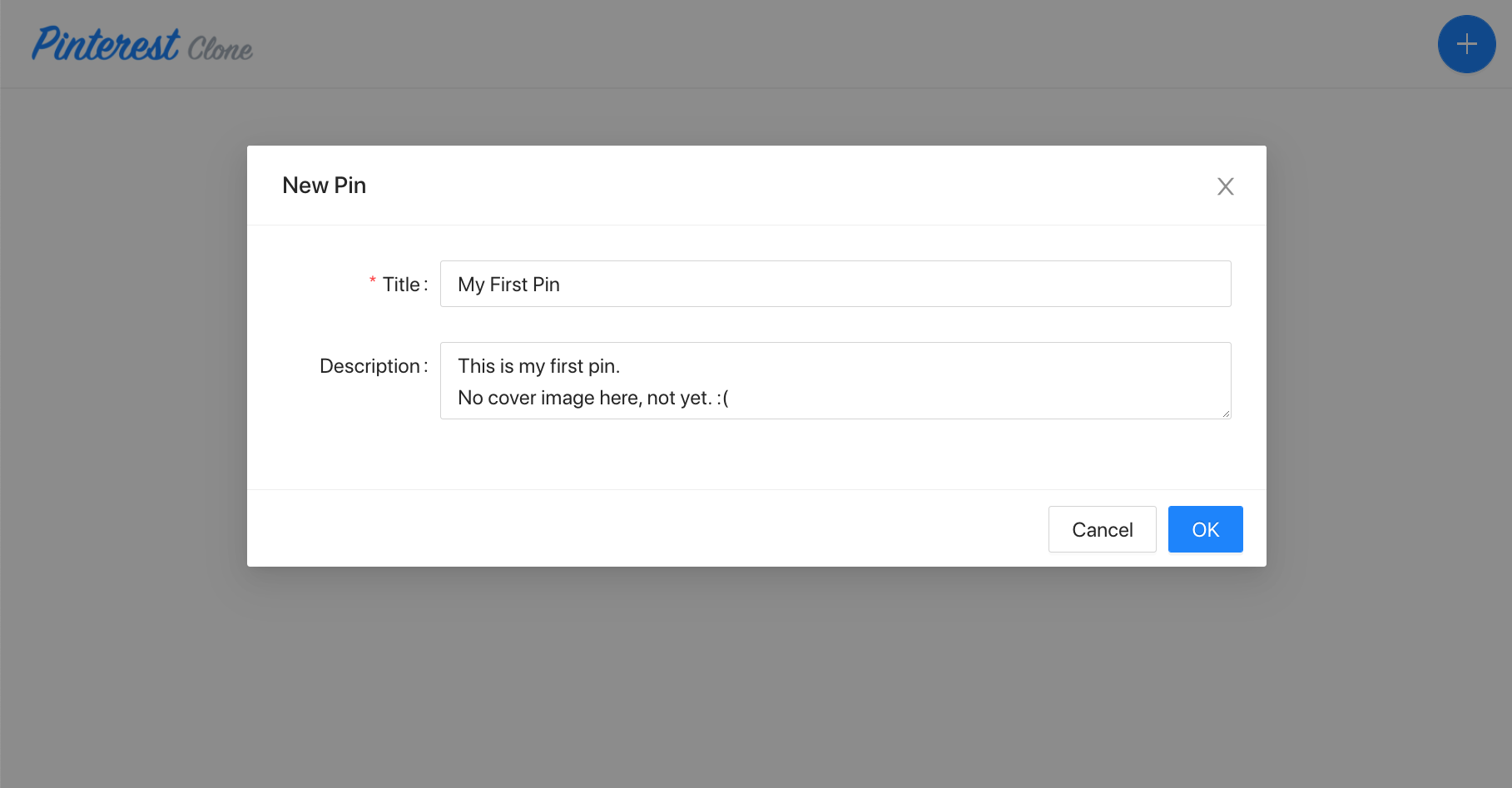
<Modal
title="New Pin"
width={700}
visible={props.visible}
onOk={onModalOk}
onCancel={onModalCancel}
>
<Form.Item name={["title"]} label="Title" rules={[{ required: true }]}>
<Input />
</Form.Item>
<Form.Item name={["description"]} label="Description">
<Input.TextArea />
</Form.Item>
</Modal>
</Form>
);
};
export default NewPinModal;
As we can see, in order to create the modal dialog, we’re completely relying on the Ant Design React library. To create the modal dialog, we’re using the Modal component, to create the form, we’re using the Form component, and we’re using the Input and Input.TextArea components to render the basic form fields.
For more information on Ant Design React library and all of the components in offers, make sure to check out its documentation .
Do note that the form in the modal dialog doesn’t include the cover image field yet. We’ll add this field later, when we’ll be covering the file upload functionality.
Finally, when it comes to interacting with our GraphQL API, in order to issue the CreatePin GraphQL mutation, we’re using Apollo Client’s useMutation React hook.
For the purposes of this tutorial, we’ve included all of the React component’s code in a single file. But, you can reorganize the code into multiple files, if you prefer that.
Add the New Pin Button to Header
Now that we have the New Pin modal dialog ready to go, let’s create the mentioned ⨁ icon, which will enable users to actually open it.
So, let’s update the Layout component with the following lines of code:
import React, { useState } from "react";import { Divider, Button } from "antd";import { PlusOutlined } from "@ant-design/icons";import { Link } from "@webiny/react-router";import logo from "~/images/logo.png";import NewPinModal from "./NewPinModal";
/** * The default layout component which you can use on any page. * Feel free to customize it or create additional layout components. */const Layout: React.FC<{ className: string }> = props => {   const [visible, setVisible] = useState(false);
  return (      <div className="layout">          {/* We're using the `nav` tag for rendering the header. */}          <nav>              <div>                  <Link to={"/"}>                      <img src={logo} className="logo" alt={"Pinterest Clone"} />                  </Link>              </div>               <div>                   <Button                      onClick={() => setVisible(true)}                      type="primary"                      size={"large"}                      shape="circle"                      icon={<PlusOutlined />}                  />               </div>          </nav>          <Divider style={{ margin: 0 }} />
          {/* The pages are rendered within the `main` tag. */}          <main className={props.className}>{props.children}</main>          <NewPinModal visible={visible} onClose={() => setVisible(false)} />      </div>  );};
export default Layout;
Final Result
With all of the code updates in place, we should be able to see the ⨁ icon in the header and open the New Pin dialog by clicking on it. And, of course, we should be able to create new pins by simply filling the form and pressing the OK button. Feel free to create as much pins as you like!
Once the form is submitted, the CreatePin GraphQL mutation will be issued. If you’re using a browser like Google Chrome , you can see that via the Developer Tools’s Network tab.
Note that, of course, since we didn’t create the homepage yet, nothing will actually be shown on it after we’ve submitted the form. This is something we’ll be covering in the next section.